Data viz
Reka Solymosi, Sam Langton & Emily Buehler
4 July 2019
A picture is worth a thousand words; when presenting and interpreting data this basic idea also applies. There has been, indeed, a growing shift in data analysis toward more visual approaches to both interpretation and dissemination of numerical analysis. Part of the new data revolution consists in the mixing of ideas from visualisation of statistical analysis and visual design. Data visualisation is one of the most interesting areas of development in the field.
Good graphics not only help researchers to make their data easier to understand by the general public. They are also a useful way for understanding the data ourselves. In many ways it is very often a more intuitive way to understand patterns in our data than trying to look at numerical results presented in a tabular form.
Recent research has revealed that papers which have good graphics are perceived as overall more clear and more interesting, and their authors perceived as smarter (see this presentation)
As with other aspects of R, there are a number of core functions that can be used to produce graphics. For example, we’ve already used plot(). However these offer limited possibilities for building graphs, and it is by exploring packages that are developed especially for graphing.
The package we will be using throughout this tutorial is ggplot2. The aim of ggplot is to implement the grammar of graphics. The ggplot2 package has excellent online documentation.
If you don’t already have the package installed, you will need to do so using the install.packages() function. Remember that ggplot2 is part of the tidyverse, so if you already have the tidyverse package installed, you should be all set.
You will then need to load up the package
library(ggplot2) The grammar of graphics defines various components (layers) of the graphic. Some of the most important are:
The data: For using
ggplot2the data has to be stored as a data frameThe aesthetics: They describe the visual characteristics that represent the data you are interested in (e.g., position, size, colour, shape, transparency).
The geoms: They describe the objects that represent the data (e.g., points, lines, polygons, etc.).
Facets: They describe how data is split into subsets and displayed as multiple small graphs.
Stats: They describe statistical transformations that typically summarise data.
Anatomy of a plot
Essentially the philosophy behind the grammar of graphics is that all data visualisations are made up of layers. ggplot2 is based on this concept: every graph can be built using the same few components. You will notice as we go along that each line of code used to build a visualisation with ggplot2 refers to one of these layers (e.g. data, aesthetics).
Take this example (all taken from Wickham, H. (2010). A layered grammar of graphics. Journal of Computational and Graphical Statistics, 19(1), 3-28.)
You have a table such as:

You then want to plot this. To do so, you want to create a plot that combines the following layers:

This will result in a final plot:

The three key layers for visualising data according to the grammar of graphics can be summarised like this (below). There are more than three layers in total, but these three are fundamental to creating any basic data visualisation:

Let’s have a look at this with some data. We have gone through the exercise of tidying the football banning order offences yesterday, so let’s use this data now, and use visualisation to look at the number of banning orders for different football clubs.
First read the data in from wherever you had saved it. If you don’t remember, you can read it in from the gitub page. Make sure you’re reading in the tidy data version.
fbo <- read.csv("https://raw.githubusercontent.com/rcatlord/GSinR_materials/master/6_visualise/fbo-by-club-supported-cleaned.csv")Now let’s look at different numbers of banning orders for clubs in different leagues. As a first step, let’s just plot the number of banning orders for each club. Let’s build this plot:
ggplot(data = fbo,                                    # data
       aes(x = Club.Supported, y=Banning.Orders)) +   # aesthetics
   geom_point()                                       # geometry
The first line above begins a plot by calling the ggplot() function, and putting the data into it. On the second line, within the aes() command, you pass the specific variables which you want to plot. In this case, we are only plotting one variable (clubs) against another (banning orders).
On the third line, we add the geometry. This is where we tell R what we want the graph to be. In other words: what type of graph do we want to represent the two variables? Here, we say we want it to be points. Because we have already specified the data and the variables, the geom_point() command is empty - it already has the basic information required. You can see a list of all possible geoms here.
We can tweak the display of the graph by using the coordinates layer. Here I used theme_bw() which is a nice clean theme. You can try with other themes. To get a list of themes you can also see the resource here.
ggplot(data = fbo,                                    # data
       aes(x = Club.Supported, y=Banning.Orders)) +   # aesthetics
   geom_point()                                   +   # geometry
   theme_bw()                                         # background coords theme
This theme element can do a lot more. For example, here you can’t really read the axis labels because they’re all overlapping. One solution would be to rotate your axis labels 90 degrees, with the following code: axis.text.x = element_text(angle = 90, hjust = 1). You pass this code to the theme argument.
ggplot(data = fbo, aes(x = Club.Supported, y = Banning.Orders)) + geom_point() +
    theme(axis.text.x = element_text(angle = 90, hjust = 1))
OK what if we don’t want it to be points, but instead we wanted it to be a bar graph?
ggplot(data = fbo,                                         # data
       aes(x = Club.Supported, y=Banning.Orders)) +        # aesthetics
   geom_bar(stat = "identity") +                           # geometry
  theme(axis.text.x = element_text(angle = 90, hjust = 1)) # background coords theme
You might notice here we pass an argument stat = "identity" to geom_bar() function. This is because you can have a bar graph where the height of the bar shows frequency (stat = “count”), or where the height is taken from a variable in your dataframe (stat = “identity”). Here we specified a y-value (height) as the Banning.Orders variable.
So this is cool! But what if I like both?
Well this is the beauty of the layering approach of ggplot2. You can layer on as many geoms as your heart desires!
ggplot(data = fbo,                                        # data
       aes(x = Club.Supported, y=Banning.Orders)) +       # aesthetics
  geom_bar(stat = "identity") +                           # geometry 1
  geom_point()+                                           # geometry 2
theme(axis.text.x = element_text(angle = 90, hjust = 1))  # background coords theme
You can add other things too. For example you can add the mean number of Banning Orders:
ggplot(data = fbo,                                        # data
       aes(x = Club.Supported, y=Banning.Orders)) +       # aesthetics
  geom_bar(stat = "identity") +                           # geometry 1
  geom_point() +                                          # geometry 2
  geom_hline(yintercept = mean(fbo$Banning.Orders)) +     # mean line
theme(axis.text.x = element_text(angle = 90, hjust = 1))  # background coords theme
This is basically all you need to know to build a graph!
What graph should I use?
There are a lot of points to consider when you are choosing what graph to use to visually represent your data. There are some best practice guidelines, but at the end of the day, you need to consider what is best for your data. What do you want to show? What graph will best communicate your message? Is it a comparison between groups? Is it the frequency distribution of one variable?
As some guidance, you can use the below cheatsheet, taken from Nathan Yau’s blog Flowingdata:

However, keep in mind that this is more of a guideline, aimed to nudge you in the right direction. There are many ways to visualise the same data, and sometimes you might want to experiment with some of these, see what the differences are.
There is also a vast amount of research into what works in displaying quantitative information. The classic book is The Visual Dispay of Quantitative Information by Edward Tufte, but since him there have been many other researchers who focus on approaches to displaying data.
They tend to result in recommendations on what to use (and not use) in certain contexts
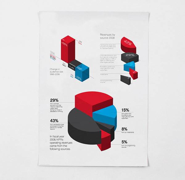
For example, most data visualisation experts agree that you should not use 3D graphics unless there is a meaning to the third dimension. So using 3D graphics just for decoration, as in this case is normally frowned upon. However there are cases when including a third dimension is vital to communicating your findings. See this example.
Also often certain chart types are villainous. The pie chart is one such example. A lot of people really dislike piecharts, eg see here or here. If you want to display proportion, research indicates that a square pie chart is more likely to be interpreted correctly by viewers: see here
Also, in some cases bar plots can hide important features of your data, and might not be the most appropriate means for comparison:

This has lead to a kickstarter campaign around actually banning bar plots…!
In any case, the plot that you use depends on the data you are plotting, as well as the message you want to convey with the plot.
So for example, returning again to the difference between number of banning orders between clubs in different leagues, what are some ways of plotting these?
One suggestion is to make a histogram for each one. You can use ggplot’s facet_wrap() option to split graphs by a grouping variable. For example, to create a histogram of banning orders you write:
ggplot(data = fbo, aes(x = Banning.Orders)) +
  geom_histogram()
Now to split this by League.of.the.Club.Supported, you use facet_wrap() in the coordinate layer of the plot.
ggplot(data = fbo, aes(x = Banning.Orders)) +
  geom_histogram() +
  facet_wrap(~League.of.the.Club.Supported)
Well you can see there’s different distribution in each league. But is this easy to compare? Maybe another approach would make it easier?
Personally, I like boxplots for showing distribution. So let’s try:
ggplot(data = fbo, aes(x = League.of.the.Club.Supported, y = Banning.Orders)) +
geom_boxplot() 
This makes the comparison significantly easier, right? If you want a less informative but more unique way of visualising the distributions, try the geom_violin geometry option. Whichever one you like, the order of the plots is strange! This is because the league variable is a factor (a categorical variable). The good thing about factors is that we can rearrange their categories as we please. If we don’t describe an order, then R uses the alphabetical order. So let’s reorder our factor:
fbo$League.of.the.Club.Supported <- factor(fbo$League.of.the.Club.Supported, levels = c("Premier League", "Championship", "League One", "League Two", "Other clubs"))And now create the plot again:
ggplot(data = fbo, aes(x = League.of.the.Club.Supported, y = Banning.Orders)) +
geom_boxplot() 
Now this is great! We can see that the higher the league the more banning orders they have (any ideas why?). If you liked the boxplot from the slides, you can directly apply most of that code to this visual to improve it a bit.
We’ll now go through some examples of making graphs using ggplot package.
Histograms
Histograms are useful ways of representing quantitative variables visually.
As mentioned earlier, we will emphasise in this course the use of the ggplot() function. With ggplot() you start with a blank canvass and keep adding specific layers. The ggplot() function can specify the dataset and the aesthetics (the visual characteristics that represent the data).
To get the data we’re going to use here, load up the package “gapminder”.
library(gapminder)This package has a dataframe called “gapminder”. This is an excerpt of the Gapminder data on life expectancy, GDP per capita, and population by country. To access the codebook (how you find out what variables are) use the “?”.
This dataframe has data from 1952 to 2007, but here we want to focus on just the most recent year. So let’s select only data from 2007:
gapminder_2007 <- filter(gapminder, year==2007)OK so let’s make a graph about the variable which represents the life expectancy by country (‘lifeExp’).
If you want to produce a histogram with the ggplot function, you would use the following equivalent code:
ggplot(gapminder_2007, aes(x = lifeExp)) + # The "aes" argument defines the aesthetics for the plot. Here, we are telling R that the data frame for plotting is gapminder_2007 and our X variable, displayed in the X axis, will be life expectancy. So we are specfying that we are using the "lifeExp" variable to display a position in the X axis.
geom_histogram() # If we just run the function in the first line we won't be plotting anything, we have to gell R what type of object, or geom, is going to represent the data that we specified in the aesthetics. There are multiple geoms we can use. For a histogram we use the geom_histogram. 
So you can see that ggplot works in a way that you can add a series of additional specifications (layers, annotations). In this simple plot the ggplot function simply maps lifeExp as the variable to be displayed (as one of the aesthetics) and the dataset. Then you add the geom_histogram to tell R that you want this variable to be represented as a histogram. Later we will see what other things you can add.
A histogram is simply putting cases in “bins” and then creates a bar for each bin. You can think of it as a visual grouped frequency distribution. Note that the default option for a histogram is a count on the Y axis, so we don’t actually need to specify what we want on the Y axis. The code we have used so far has used a bin-width of size range/30 as R kindly reminded us. But you can modify this parameter if you want to get a rougher or a more granular picture. In fact, you should always play around with different specifications of the bin-width until you find one that tells the full story in a parsimonious way.
ggplot(gapminder_2007, aes(x = lifeExp)) +
  geom_histogram(binwidth = 1) # We can pass arguments to the the geoms, here we are changing the size of the bins (for further details on other arguments you can check the help files)
Using bin-width of 1 we are essentially creating a bar for every one unit increase in the life expectancy. We can see that most countries have life expectancy of 60 or over.
# Let's sum the number of countries with a value of 60 or over in life expectancy
sum(gapminder_2007$lifeExp >= 60 )
[1] 99We can see that the large majority of countries, 99 out of 142, have a life expectancy over 60. But we can also see that there are some countries that have a low life expectancy. You can see how we can use visualisations to show the data and get a first feeling for how it may be distributed.
Often we visualise data because we want to compare distributions. Most of data analysis is about making comparisons. We are going to explore whether the life expectancy is different for less affluent countries. The variable gdpPercap measures the country’s GDP per capita. For the purposes of this illustration I want to dichotomise this variable. We’ve covered data manipulation already, so you hopefully you can remember the if_else command used below. Here we will be grouping anything that’s got GDP higher than the mean as “high gdp”, and everything else as “low gdp”.
gapminder_2007 <- gapminder_2007 %>%
  mutate(gdp_factor = if_else(gdpPercap > mean(gdpPercap), "high gdp", "low gdp"))

gapminder_2007$gdp_factor <- as.factor(gapminder_2007$gdp_factor) # The variable we created was a character vector, this step transforms it into a factor (many functions designed to work with categorical variables expect a factor as an input, not just a character vector).
Now we can produce the plot:
ggplot(gapminder_2007, aes(x = lifeExp)) +
  geom_histogram(binwidth = 1) +
  facet_wrap(~ gdp_factor) # Facets are another element of the grammar of graphics, we use it to define subsets of the data to be represented as multiple groups, here we are asking R to produce two plots defined by the levels of the factor we just created.
Visually this may not look great, but it begins to tell a story. We can see that there is a lower proportion of countries with low life expectancy in the group of countries that have higher life expectancy. It is a flatter, less skewed distribution. You can see how the facet_wrap() expression is telling R to create the histogram of the variable mentioned in the ggplot function for the groups defined by the categorical input of interest (the factor “gdp_factor”).
Instead of using facets, we could overlay the histograms with a bit of transparency. Transparencies work better in screens than in printed document, so keep in mind this when deciding whether to use them instead of facets. The code is as follows:
ggplot(gapminder_2007, aes(x = lifeExp, fill = gdp_factor)) + # "fill" refers to the fill of the geometry which in this case is the bars of the histogram.
  geom_histogram(position = "identity", alpha = 0.4) # "position = identity" tells R to overlay the distributions and "alpha" asks for the degree of transparency, a lower value will be more transparent
Density plots
For smoother distributions seen in a histogram, you can use density plots. You should have a healthy amount of data to use these or you could end up with a lot of unwanted noise. Let’s first look at the single density plot for all cases:
ggplot(gapminder_2007, aes(x = lifeExp)) +
geom_density() 
In a density plot the area under the lines sum to 1 and the Y, vertical, axis now gives you the estimated probability for the values in the X, horizontal, axis. As you can observe, it provides a smoother representation of the distribution (as compared to the histograms).
You can also use this to compare the distribution of a quantitative variable across the levels in a categorical variable (factor):
# We are mapping "gdp_factor" as the variable colouring the lines
ggplot(gapminder_2007, aes(x = lifeExp, colour = gdp_factor)) +
geom_density() 
Or you could use transparencies:
ggplot(gapminder_2007, aes(x = lifeExp, fill = gdp_factor)) + geom_density(alpha = 0.3)
Did you notice the difference with the comparative histograms? By using density plots we are rescaling to ensure the same area for each of the levels in our grouping variable. This makes it easier to compare two groups that have different frequencies. The areas under the curve add up to 1 for both of the groups, whereas in the histogram the area within the bars represent the number of cases in each of the groups. If you have many more cases in one group than the other it may be difficult to make comparisons or to clearly see the distribution for the group with fewer cases. So, this is one of the reasons why you may want to use density plots.
Box plots
Box plots are an interesting way of presenting the 5 number summary in a visual way. For this illustration, I am going to display the distribution of the GDP in the various countries:
ggplot(gapminder_2007, aes(x = continent, y=gdpPercap)) +
  geom_boxplot()
With a boxplot like this you can see straight away that continents differ from one another.
Scatter plots with two variables
When looking at the relationship between two quantitative variables, nothing beats the scatterplot. This is a lovely article in the history of the scatterplot!
A scatterplot plots one variable in the Y axis, and another in the X axis. Typically, if you have a clear outcome or response variable in mind, you place it in the Y axis, and you place the explanatory variable in the X axis.
This is how you produce a scatterplot with ggplot():
# A scatterplot of crime versus median value of the properties
ggplot(gapminder_2007, aes(x = gdpPercap, y = lifeExp)) +
  geom_point()
Each point represents a case in our dataset and the coordinates attached to it in this two dimensional plane are given by their value in the Y (life expectancy) and X (GDP per capita) variables.
One of the things you may notice with a scatterplot is that even with a smallish dataset such as this, with just about 142 cases, overplotting may be a problem. When you have many cases with similar (or even worse the same) value, it is difficult to tell them apart. There’s a variety of ways of dealing with overplotting. One possibility is to add some transparency to the points:
ggplot(gapminder_2007, aes(x = gdpPercap, y = lifeExp)) +
  geom_point(alpha=0.4) # you will have to test different values for alpha
Overplotting can occur when a continuous measurement is rounded to some convenient unit. This has the effect of changing a continuous variable into a discrete ordinal variable. For example, age is measured in years and body weight is measured in pounds or kilograms. Age is a discrete variable: it only takes integer values. That’s why you see the points lined up in parallel vertical lines. This also contributes to the overplotting.
One way of dealing with this particular problem is by jittering. Jittering is the act of adding random noise to data in order to prevent overplotting in statistical graphs. In ggplot one way of doing this is by passing an argument to geom_point specifying you want to jitter the points. This will introduce some random noise so that age looks less discrete, but doesn’t alter the general pattern observed.
ggplot(gapminder_2007, aes(x = gdpPercap, y = lifeExp)) +
  geom_point(alpha=0.2, position="jitter") # Alternatively you could replace geom_point() with geom_jitter() in which case you don't need to specify the position
Another alternative for solving overplotting is to bin the data into rectangles and map the density of the points to the fill of the colour of the rectangles.
ggplot(gapminder_2007, aes(x = gdpPercap, y = lifeExp)) +
  stat_bin2d()
# The same but with nicer graphical parameters
ggplot(gapminder_2007, aes(x = gdpPercap, y = lifeExp)) +
  stat_bin2d(bins=50) + # by increasing the number of bins we get more granularity
  scale_fill_gradient(low = "lightblue", high = "red") # change colors
What this is doing is creating boxes within the two dimensional plane; counting the number of points within those boxes; and attaching a colour (fill) to the box in function of the density of points within each of the rectangles.
When looking at scatterplots, you can produce a smoother line using geom_smooth. This is computed using the “loess” method. A Loess regression line subsets chunks of data around your X axis to try to estimate a regression line that fits well a region of the data.
ggplot(gapminder_2007, aes(x = gdpPercap, y = lifeExp)) +
  geom_point(alpha=.4) +
geom_smooth(colour="red", size=1, se=TRUE) 
The se argument asks whether to display the confidence intervals (I like them, so have specified TRUE), colour is simply asking for a red line instead of blue, and size makes the line a bit thicker with size 1).
The line, as the scatterplot, seems to be suggesting an overall curvilinear relationship that almost flattens out once the GDP is around 30,000.
Scatter plots conditioning in a third variable
There are various ways to plot a third variable in a scatterplot. You could go 3D and in some contexts that may be appropriate. But more often than not it is preferable to use only a two dimensional plot.
If you have a grouping variable you could map it to the colour of the points as one of the aesthetics arguments. Here we return to the Gapminder scatterplot but will add a third variable, that indicates the continent.
# Scatterplot with two quantitative variables and a grouping variable, we are telling R to tell "continent", as a factor.
ggplot(gapminder_2007, aes(x = gdpPercap, y = lifeExp, colour = continent)) +
geom_point() 
We can see distinct differences between continents.
We can also map a quantitative variable to the colour aesthetic. When we do that, instead of different colours for each category we have a gradation in colour from darker to lighter depending on the value of the quantitative variable. Below we display the relationship between life expectancy and gdp conditioning on the size of the population of the country.
ggplot(gapminder_2007, aes(x = gdpPercap, y = lifeExp, colour = pop)) +
geom_point() 
You could map the third variable to a different aesthetic (rather than colour). For example, you could map pop to size of the points. This is called a bubblechart. The problem with this, however, is that it can make overplotting more acute sometimes.
ggplot(gapminder_2007, aes(x = gdpPercap, y = lifeExp, size = pop)) +
  geom_point() # You may want to add alpha for some transparency here.
If you have larger samples and the patterns are not clear, conditioning in a third variable can produce hard to read scatterplots (even if you use transparencies and jittering). In these cases, we could try to use facets instead using facet_wrap().
ggplot(gapminder_2007, aes(x = gdpPercap, y = lifeExp)) +
  geom_point(alpha=0.4, position="jitter") +
  facet_wrap( ~ continent)
Titles and legends in ggplot2
We have introduced a number of various graphical tools, but there are many other ways you can further customise your graphs. Here, I am just going to give you some code for how to modify the titles and legends you use. For adding a title for a ggplot graph you can use the title option within labs().
ggplot(gapminder_2007, aes(x = gdpPercap, y = lifeExp, colour = continent)) +
  geom_point() +
  labs(title = "Fig 1.Life Expectancy, GDP Per Capita in different Continents")
If you don’t like the default background theme for ggplot you can use a theme as discussed at the start, for example with creating a black and white background by adding theme_bw() as a layer:
ggplot(gapminder_2007, aes(x = gdpPercap, y = lifeExp, colour = continent)) +
  geom_point() +
  labs(title = "Fig 1.Life Expectancy, GDP Per Capita in different Continents") +
  theme_bw()
Using labs() you can change the text of axis labels (and the legend title), which may be handy if your variables have cryptic names. Equally you can manually name the labels in a legend. Let’s say we wanted the labels to be all upper case…
ggplot(gapminder_2007, aes(x = gdpPercap, y = lifeExp, colour = continent)) +
  geom_point() +
  labs(title = "Fig 1.Life Expectancy, GDP Per Capita in different Continents",
       x = "GDP per capita",
       y = "Life expectancy at birth, in years",
       colour = "Continent") +
  scale_colour_discrete(labels = c("AFRICA", "AMERICAS", "ASIA", "EUROPE", "OCEANIA"))
Bar charts
You may be wondering, what about categorical data? So far we have only discussed various visualisations where at least one of your variables is quantitative (continuous). When your variable is categorical you can use bar plots. We map the factor variable in the aesthetics and then use the geom_bar() function to ask for a bar chart. The default option for geom_bar() is a count, because that’s what most people want barplots for. For this reason, you don’t specify the Y variable, ggplot calculates the counts for you under the hood.
ggplot(gapminder_2007, aes(x=gdp_factor)) +
  geom_bar()
Unfortunately, the levels in this factor are ordered by alphabetical order, which is not always what we want. We can modify this by reordering the factors levels first -click here for more details. You could do this within the ggplot function (just for the visualisation), but in real life you would want to sort out your factor levels in an appropriate manner more permanently. As discussed earlier, this is the sort of thing you do as part of pre-processing your data. And then plot.
# Print the original order
print(levels(gapminder_2007$gdp_factor))
[1] "high gdp" "low gdp" # Reordering the factor levels. Notice that I am creating a new variable. It is often not unwise to do this to avoid messing up your original data.
gapminder_2007$gdp_factor_2 <- factor(gapminder_2007$gdp_factor, levels=c('low gdp', 'high gdp'))
# Plotting the variable again (and subsetting out the NA data)
ggplot(gapminder_2007, aes(x=gdp_factor_2)) +
geom_bar()
We can also map a second variable to the aesthetics, for example, let’s take a look at the low/high gdp variable by continent. For this we produce a stacked bar chart.
ggplot(gapminder_2007, aes(x=continent, fill = gdp_factor_2)) +
  geom_bar()
These sort of stacked bar charts are not terribly helpful if you are interested in understanding the relationship between these two variables. Instead what you may want is a proportional stacked bar chart.
First we need to scale the data to 100% within each stack and then plot. The code here is also more complex. Again, I’m not expecting you to fully understand all of it. In your early days of using R, you will find yourself cutting and pasting chunks of code that you will only fully understand with practice.
# First we create a subset with the relevant data
.df1 <- data.frame(x = gapminder_2007$continent, z = gapminder_2007$gdp_factor)
# Then we compute the proportions within the stacks
.df1 <- as.data.frame(with(.df1, prop.table(table(x, z), margin = NULL)))
# Finally we plot
stbcf <- ggplot(.df1, aes(x = x, y = Freq, fill = z)) +
  geom_bar(position = "fill", stat = "identity") +
  scale_y_continuous(expand = c(0.01, 0), labels = scales::percent_format()) + # Adapts the scale of the y axis and express the values in percentage terms
  labs(x = "Continent", y = "percent") + # change the labels
  guides(fill = guide_legend(title = NULL)) # This removes the title of the legend (bcsvictim), since the labels of the categories are self-explanatory.
stbcf # autoprint the plot, notice how earlier rather than printing directly I stored the plot in the object with this name (the reason is that I want to use this plot later and don't want to rerun all the code again)
rm(.df1) # to remove the data frame we createdSometimes, you may want to flip the axis, so that the bars are displayed horizontally. You can use the coord_flip() function for that.
# First we invoke the plot we created and stored earlier and then we add an additional specification with coord_flip()
stbcf + coord_flip()
You can also use coord_flip() with other ggplot plots (e.g., boxplots, bar charts).
A particular type of bar chart is the divergent stacked bar chart, often used to visualise Likert scales. You may want to look at some of the options available for it via the HH package, the likert package or sjPlot. But we won’t cover them here in detail.
Keep in mind that knowing how to get R to produce a particular visualisation is only half the job. The other half is knowing when to produce a particular kind of visualisation. This blog, for example, discusses some of the problems with stacked bar charts and the exceptional circumstances in which you may want to use them.
There are other tools sometimes used for visualising categorical data. Increasingly popular are mosaic plots. R is pretty good at doing them. However, we have covered already a lot of ground, plus I have some sympathy for Stephen Few’s arguments against mosaic plots.
What I would use instead are waffle charts. They’re super easy to make with the “waffle” package.
Here is an example using some Brexit data:
library(waffle)t <- c('Remain' = 35,
"Leave" = 37,
"Didn't vote" = 28)
waffle(t, rows = 10, colors=c("#a6cee3",
"#1f78b4",
"#33a02c"),
title="Brexit results",
xlab="1 square = 1%")
You can read more about them here.
Interactivity
So we talked about plotly in the presentation. There are excellent resources available online, so I do recommend some further reading.
Other ways of making your charts and overall presentation of information interactive include building Shiny dashboards.
Also if you have some spatial data, a nice interactive way to present it is to use leaflet package.
There are many many ways to visualise and present data available, and this is a really fun thing to play around with, and one of the major strengths of R. I hope that this introduction has been sufficient to get you interested in learning more, and that you can use R to make fun visualisations of your data!