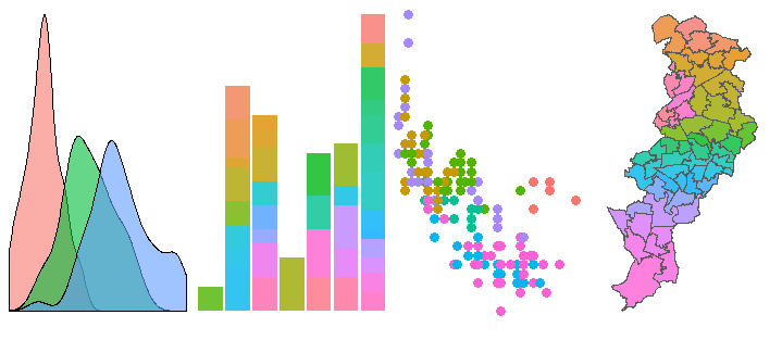
class: center, middle, inverse, title-slide # <div class="line-block">Getting Started in R<br /> an introduction to data analysis and visualisation</div> ## Visualising Data ### Réka Solymosi, Sam Langton & Emily Buehler ### 4 July 2019 --- class: inverse, center, middle # Data viz --- ### The grammar of graphics 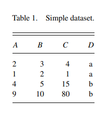 [Wickham, H. (2010). A layered grammar of graphics. Journal of Computational and Graphical Statistics, 19(1), 3-28.](http://vita.had.co.nz/papers/layered-grammar.pdf) --- ### The grammar of graphics 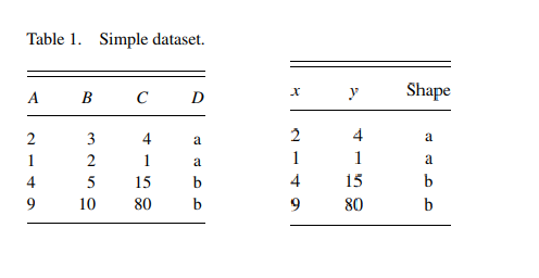 [Wickham, H. (2010). A layered grammar of graphics. Journal of Computational and Graphical Statistics, 19(1), 3-28.](http://vita.had.co.nz/papers/layered-grammar.pdf) --- ### The grammar of graphics 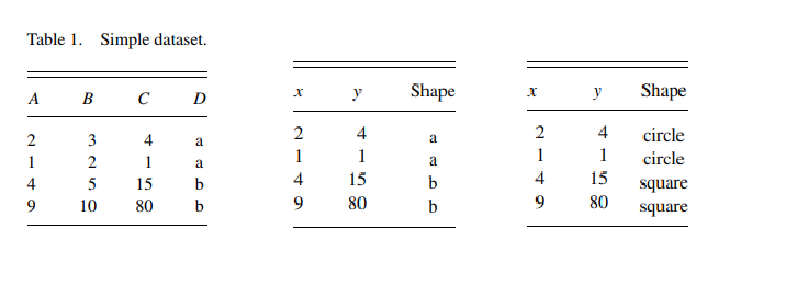 [Wickham, H. (2010). A layered grammar of graphics. Journal of Computational and Graphical Statistics, 19(1), 3-28.](http://vita.had.co.nz/papers/layered-grammar.pdf) --- ### The grammar of graphics 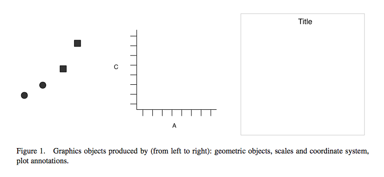 [Wickham, H. (2010). A layered grammar of graphics. Journal of Computational and Graphical Statistics, 19(1), 3-28.](http://vita.had.co.nz/papers/layered-grammar.pdf) --- ### The grammar of graphics 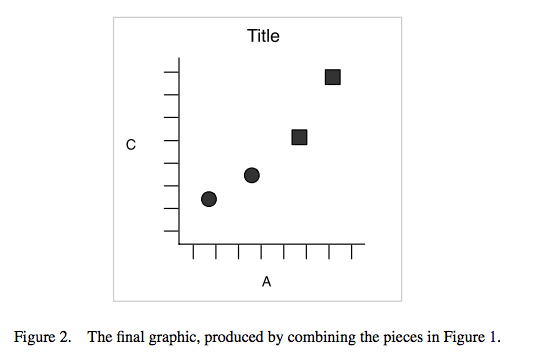 [Wickham, H. (2010). A layered grammar of graphics. Journal of Computational and Graphical Statistics, 19(1), 3-28.](http://vita.had.co.nz/papers/layered-grammar.pdf) --- ### The grammar of graphics  --- ### Creating a ggplot ```r library(ggplot2) ``` ```r ggplot(data = mpg) + geom_point(mapping = aes(x = displ, y = hwy)) ``` <img src="viz_slides_files/figure-html/unnamed-chunk-2-1.png" height="400px" /> --- ### Pseudocode ```r ggplot(data = <DATA>) + <GEOM_FUNCTION>(mapping = aes(<MAPPINGS>)) ``` --- ### 3 variables to 1 plot: `colour =` ```r ggplot(data = mpg) + geom_point(mapping = aes(x = displ, y = hwy, colour = class)) ``` <img src="viz_slides_files/figure-html/unnamed-chunk-4-1.png" height="400px" /> --- ### 3 variables to 1 plot: `size =` ```r ggplot(data = mpg) + geom_point(mapping = aes(x = displ, y = hwy, size = class)) ``` ``` ## Warning: Using size for a discrete variable is not advised. ``` <img src="viz_slides_files/figure-html/unnamed-chunk-5-1.png" height="400px" /> --- ### 3 variables to 1 plot: `shape =` ```r ggplot(data = mpg) + geom_point(mapping = aes(x = displ, y = hwy, shape = class)) ``` ``` ## Warning: The shape palette can deal with a maximum of 6 discrete values ## because more than 6 becomes difficult to discriminate; you have 7. ## Consider specifying shapes manually if you must have them. ``` ``` ## Warning: Removed 62 rows containing missing values (geom_point). ``` <img src="viz_slides_files/figure-html/unnamed-chunk-6-1.png" height="330px" /> --- ### 3 variables to 1 plot: `facet_wrap()` ```r ggplot(data = mpg) + geom_point(mapping = aes(x = displ, y = hwy)) + facet_wrap(~ class, nrow = 2) ``` <img src="viz_slides_files/figure-html/unnamed-chunk-7-1.png" height="400px" /> --- ### Geoms How are these two plots similar? <img src="http://r4ds.had.co.nz/visualize_files/figure-html/unnamed-chunk-18-1.png" width="400px" /><img src="http://r4ds.had.co.nz/visualize_files/figure-html/unnamed-chunk-18-2.png" width="400px" /> --- ### Geoms ```r ggplot(data = mpg) + geom_point(mapping = aes(x = displ, y = hwy)) + geom_smooth(mapping = aes(x = displ, y = hwy)) ``` <img src="viz_slides_files/figure-html/unnamed-chunk-9-1.png" height="400px" /> --- ### Geoms ++  --- ### Geoms ++ [Online companions](https://www.trafforddatalab.io/graphics_companion/) 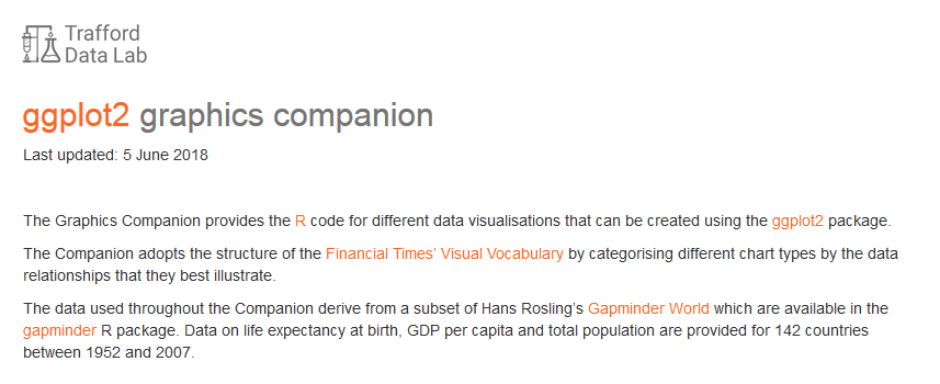 --- ### Making this plot 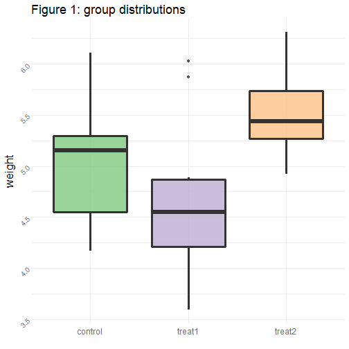<!-- --> --- ### Data + aesthetics + geom ```r bp <- ggplot(data = PlantGrowth) + geom_boxplot(mapping = aes(x = group, y = weight)) bp ``` --- ### Initial tweaks ```r bp <- ggplot(data = PlantGrowth) + geom_boxplot(mapping = aes(x = group, y = weight, fill = group), size = 1.2, alpha = 0.8) bp ``` --- ### Axes ```r bp + scale_x_discrete(labels = c("control", "treat1", "treat2")) ``` ```r # Hide x tick marks, labels, and grid lines bp + scale_x_discrete(breaks=NULL) ``` --- ### Labels ```r bp + labs(title = "Figure 1: group distributions", x = " ") ``` --- ### Colour brewers ```r bp + scale_fill_brewer(palette = "Accent") ``` --- ### Themes ```r bp + theme_minimal() ``` --- ### Themes (specific options) ```r bp + theme(legend.position = "none", axis.text.x = element_text(color="#707070", size=12), axis.title.x = element_text(size = 14), axis.text.y = element_text(color="#707070", size=10, angle=45)) ``` --- ### Making this plot ```r bp <- ggplot(data = PlantGrowth) + geom_boxplot(mapping = aes(x = group, y = weight, fill = group), size = 1.2, alpha = 0.8) + scale_x_discrete(labels = c("control", "treat1", "treat2")) + labs(title = "Figure 1: group distributions", x = " ") + scale_fill_brewer(palette = "Accent") + theme_minimal() + theme(legend.position = "none", plot.title = element_text(size=18), axis.text.x = element_text(color="#707070", size=12), axis.title.y = element_text(size=16), axis.text.y = element_text(color="#707070", size=10, angle=45)) bp ``` --- ### Making this plot interactive ```r ggplotly(bp) ``` --- ### Making this plot interactive <div id="htmlwidget-f13d8997168f315df98f" style="width:504px;height:504px;" class="plotly html-widget"></div> <script type="application/json" data-for="htmlwidget-f13d8997168f315df98f">{"x":{"data":[{"x":[1,1,1,1,1,1,1,1,1,1],"y":[4.17,5.58,5.18,6.11,4.5,4.61,5.17,4.53,5.33,5.14],"hoverinfo":"y","type":"box","fillcolor":"rgba(127,201,127,0.8)","marker":{"opacity":null,"outliercolor":"rgba(0,0,0,1)","line":{"width":1.88976377952756,"color":"rgba(0,0,0,1)"},"size":5.66929133858268},"line":{"color":"rgba(51,51,51,1)","width":4.53543307086614},"name":"ctrl","legendgroup":"ctrl","showlegend":true,"xaxis":"x","yaxis":"y","frame":null},{"x":[2,2,2,2,2,2,2,2,2,2],"y":[4.81,4.17,4.41,3.59,5.87,3.83,6.03,4.89,4.32,4.69],"hoverinfo":"y","type":"box","fillcolor":"rgba(190,174,212,0.8)","marker":{"opacity":null,"outliercolor":"rgba(0,0,0,1)","line":{"width":1.88976377952756,"color":"rgba(0,0,0,1)"},"size":5.66929133858268},"line":{"color":"rgba(51,51,51,1)","width":4.53543307086614},"name":"trt1","legendgroup":"trt1","showlegend":true,"xaxis":"x","yaxis":"y","frame":null},{"x":[3,3,3,3,3,3,3,3,3,3],"y":[6.31,5.12,5.54,5.5,5.37,5.29,4.92,6.15,5.8,5.26],"hoverinfo":"y","type":"box","fillcolor":"rgba(253,192,134,0.8)","marker":{"opacity":null,"outliercolor":"rgba(0,0,0,1)","line":{"width":1.88976377952756,"color":"rgba(0,0,0,1)"},"size":5.66929133858268},"line":{"color":"rgba(51,51,51,1)","width":4.53543307086614},"name":"trt2","legendgroup":"trt2","showlegend":true,"xaxis":"x","yaxis":"y","frame":null}],"layout":{"margin":{"t":47.2162723121627,"r":7.30593607305936,"b":41.51100041511,"l":52.5892987176807},"font":{"color":"rgba(0,0,0,1)","family":"","size":14.6118721461187},"title":{"text":"Figure 1: group distributions","font":{"color":"rgba(0,0,0,1)","family":"","size":23.9103362391034},"x":0,"xref":"paper"},"xaxis":{"domain":[0,1],"automargin":true,"type":"linear","autorange":false,"range":[0.4,3.6],"tickmode":"array","ticktext":["control","treat1","treat2"],"tickvals":[1,2,3],"categoryorder":"array","categoryarray":["control","treat1","treat2"],"nticks":null,"ticks":"","tickcolor":null,"ticklen":3.65296803652968,"tickwidth":0,"showticklabels":true,"tickfont":{"color":"rgba(112,112,112,1)","family":"","size":15.9402241594022},"tickangle":-0,"showline":false,"linecolor":null,"linewidth":0,"showgrid":true,"gridcolor":"rgba(235,235,235,1)","gridwidth":0.66417600664176,"zeroline":false,"anchor":"y","title":{"text":" ","font":{"color":"rgba(0,0,0,1)","family":"","size":14.6118721461187}},"hoverformat":".2f"},"yaxis":{"domain":[0,1],"automargin":true,"type":"linear","autorange":false,"range":[3.454,6.446],"tickmode":"array","ticktext":["3.5","4.0","4.5","5.0","5.5","6.0"],"tickvals":[3.5,4,4.5,5,5.5,6],"categoryorder":"array","categoryarray":["3.5","4.0","4.5","5.0","5.5","6.0"],"nticks":null,"ticks":"","tickcolor":null,"ticklen":3.65296803652968,"tickwidth":0,"showticklabels":true,"tickfont":{"color":"rgba(112,112,112,1)","family":"","size":13.2835201328352},"tickangle":-45,"showline":false,"linecolor":null,"linewidth":0,"showgrid":true,"gridcolor":"rgba(235,235,235,1)","gridwidth":0.66417600664176,"zeroline":false,"anchor":"x","title":{"text":"weight","font":{"color":"rgba(0,0,0,1)","family":"","size":21.2536322125363}},"hoverformat":".2f"},"shapes":[{"type":"rect","fillcolor":null,"line":{"color":null,"width":0,"linetype":[]},"yref":"paper","xref":"paper","x0":0,"x1":1,"y0":0,"y1":1}],"showlegend":false,"legend":{"bgcolor":null,"bordercolor":null,"borderwidth":0,"font":{"color":"rgba(0,0,0,1)","family":"","size":11.689497716895}},"hovermode":"closest","barmode":"relative"},"config":{"doubleClick":"reset","showSendToCloud":false},"source":"A","attrs":{"18686596203":{"x":{},"y":{},"fill":{},"type":"box"}},"cur_data":"18686596203","visdat":{"18686596203":["function (y) ","x"]},"highlight":{"on":"plotly_click","persistent":false,"dynamic":false,"selectize":false,"opacityDim":0.2,"selected":{"opacity":1},"debounce":0},"shinyEvents":["plotly_hover","plotly_click","plotly_selected","plotly_relayout","plotly_brushed","plotly_brushing","plotly_clickannotation","plotly_doubleclick","plotly_deselect","plotly_afterplot"],"base_url":"https://plot.ly"},"evals":[],"jsHooks":[]}</script> --- ###Rcolorbrewer [Sequential, diverging and qualitative colour scales from colorbrewer.org](http://ggplot2.tidyverse.org/reference/scale_brewer.html) & [Colour summaries from http://www.cookbook-r.com](http://www.cookbook-r.com/Graphs/Colors_(ggplot2)) 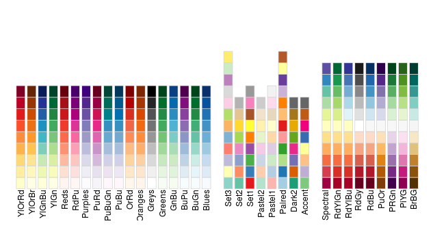 --- ### It's all the same! 